Semantic HTML and accessibility go hand in hand, but there are moments when native HTML elements alone cannot fully describe the role of a component on screen. That is where ARIA (Accessible Rich Internet Applications) roles step in. When used correctly alongside semantic elements, ARIA roles fill gaps that HTML cannot address on its own, making interfaces richer for assistive technology users.
When used incorrectly, they introduce confusion and break the accessible web design that semantic structure is supposed to provide. This guide walks you through a practical, step-by-step approach to combining ARIA roles with semantic HTML so your markup remains clean, meaningful, and genuinely accessible.
If you have ever wondered when to reach for an ARIA attribute and when to trust the native element, these four steps will give you a clear framework.
Key Takeaways
- Native semantic elements already carry implicit ARIA roles; don't duplicate them.
- Use ARIA only when no native HTML element can express the component's purpose.
- Incorrect ARIA roles actively harm screen reader users more than no role at all.
- Test every ARIA addition with at least two screen readers before shipping to production.
- Keep your document structure clean so ARIA supplements, rather than replaces, meaning.
Step 1: Understand the Implicit Roles of Semantic HTML Elements
How Native Elements Map to ARIA Roles
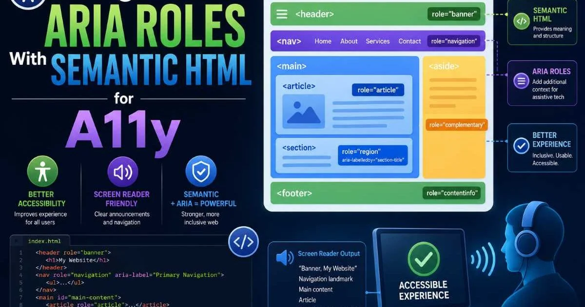
Every semantic HTML element carries an implicit ARIA role that browsers expose to the accessibility tree automatically. A <nav> element maps to role="navigation", a <main> maps to role="main", and a <button> maps to role="button". You can explore a comprehensive breakdown in this HTML5 Semantic Tags List With Code Examples. Understanding these mappings is the foundation of everything that follows in this guide.
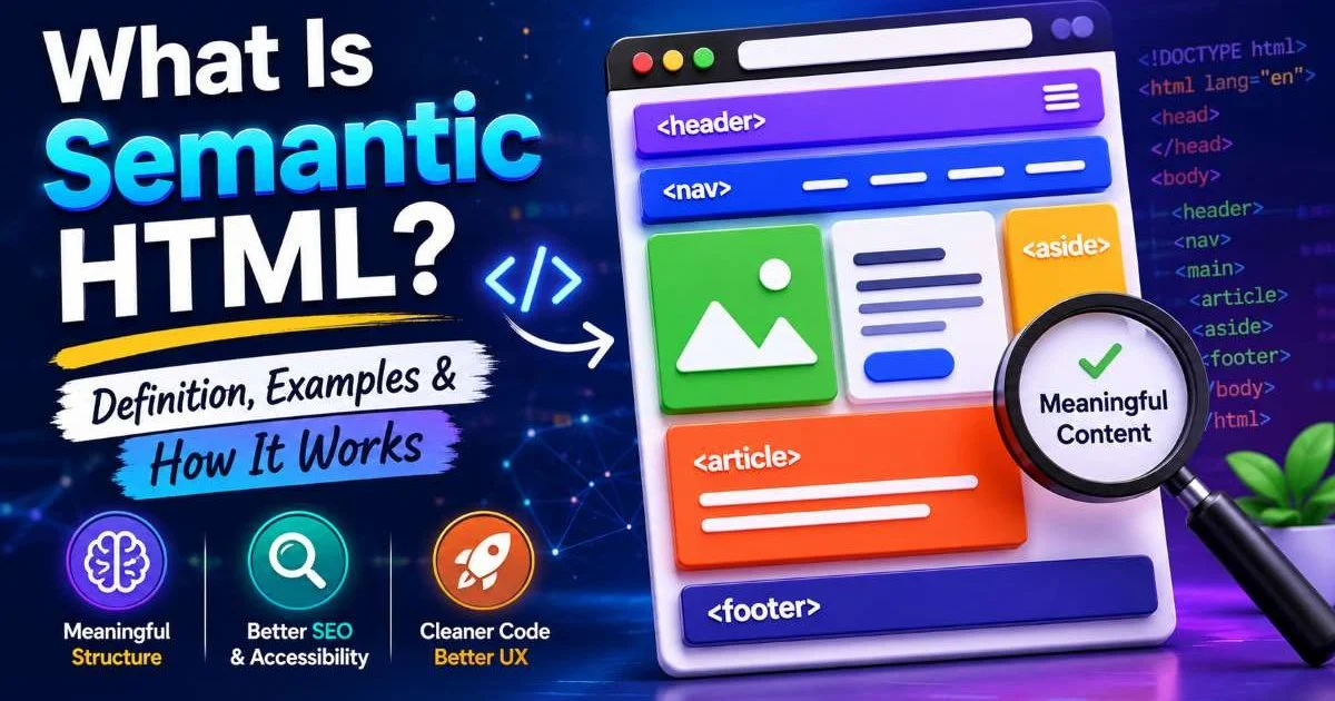
The WAI-ARIA specification explicitly states that authors should prefer native host language features whenever possible. A <header> element already tells assistive technologies it functions as a banner landmark. If you understand what semantic HTML is and how it works, you already know the browser does heavy lifting for you. The first rule of ARIA, often called "the rules of ARIA use," says: do not use ARIA if a native element already does the job.
Why Duplication Hurts More Than It Helps
Adding role="navigation" to a <nav> element does not make it "more accessible." It simply duplicates information the browser already provides. In some edge cases, older screen readers might announce the role twice, creating a stuttering experience. This redundancy also clutters your markup, making future maintenance harder for your team without adding any real value to the user experience.
Worse, developers who get comfortable sprinkling ARIA roles everywhere may start applying incorrect roles, which actively misleads assistive technology. A <div role="button"> without keyboard handling, for example, is far worse than a plain <div>. The implicit contract of role="button" tells a screen reader the element is interactive and operable with Enter and Space keys. If your code does not deliver on that promise, you have created a trap for users who rely on keyboards.
Never add ARIA roles to semantic elements that already have them. Redundant ARIA is a code smell that suggests deeper accessibility misunderstandings in a codebase.
Step 2: Identify Where ARIA Fills Genuine Gaps
Custom Widget Patterns
Some interface patterns simply do not have native HTML equivalents. A tabbed interface, a tree view, a combobox with autocomplete, or a disclosure widget all require ARIA roles to communicate their behavior to assistive technology. When you build a tab component, you need role="tablist", role="tab", and role="tabpanel" because no native elements exist for this pattern. This is where ARIA truly earns its place in your HTML structure.
Custom widgets also need ARIA states like aria-selected, aria-expanded, and aria-controls to describe dynamic behavior. A tab that is currently active needs aria-selected="true" so screen readers can tell users which panel is visible. These states change with user interaction, meaning your JavaScript must keep ARIA attributes synchronized with the visual state at all times. Drift between visual and accessible state is one of the most common sources of accessibility bugs in single-page applications.
Before building a custom widget, check the WAI-ARIA Authoring Practices Guide for established patterns with tested keyboard interactions and role assignments.
Live Region Announcements
Dynamic content updates pose a unique challenge. When a toast notification appears or a form validation error is injected into the DOM, sighted users notice immediately, but screen reader users may miss it entirely. ARIA live regions solve this problem. Adding aria-live="polite" or aria-live="assertive" to a container tells assistive technology to announce new content when it appears. No native HTML element provides this behavior, so ARIA is the correct tool here.
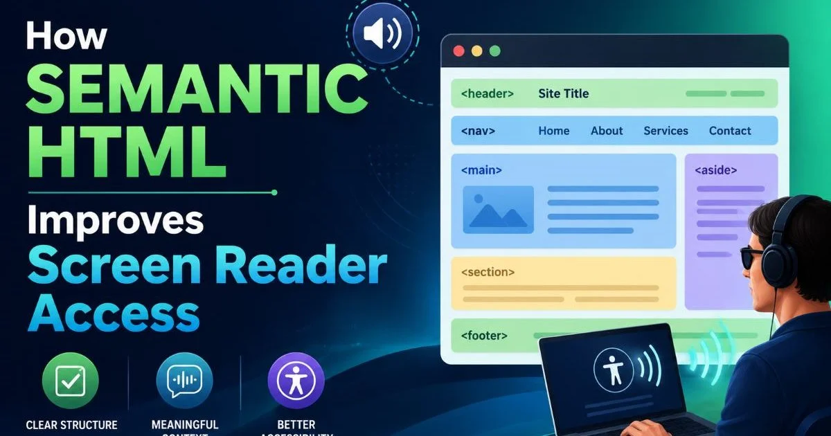
You should be thoughtful about the politeness level. An assertive announcement interrupts whatever the screen reader is currently saying, which is appropriate for urgent errors but obnoxious for low-priority status updates. For most notifications, polite is the right choice. This distinction matters enormously for the real user experience, as explained in detail in How Semantic HTML Improves Screen Reader Access. The container must exist in the DOM before content is injected; dynamically adding a live region and content simultaneously will fail in many screen readers.
Live regions that fire too frequently (such as real-time stock tickers) will overwhelm screen reader users. Throttle announcements or provide a manual refresh option.
Step 3: Implement ARIA Roles, States, and Properties Correctly
Role Assignment Rules
When you assign a role to an element, you override its native semantics completely. Applying role="presentation" to a <table> strips away all table semantics, which is fine for layout tables but devastating for data tables. Similarly, putting role="img" on a <div> that wraps an SVG illustration tells assistive technology to treat the entire container as a single image. You must also provide aria-label or aria-labelledby so the image has an accessible name. Without it, the element becomes invisible to screen reader users.
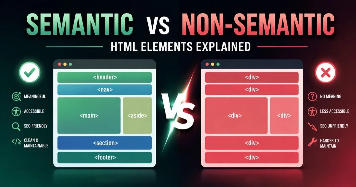
Certain roles require specific parent-child relationships. A role="tab" must be a direct child (or owned via aria-owns) of a role="tablist". A role="listitem" needs a parent with role="list". Breaking these required context relationships will cause assistive technology to ignore or misinterpret the component. The difference between semantic and non-semantic HTML elements becomes especially clear in these situations, because native elements enforce correct nesting through the HTML spec itself while ARIA roles rely entirely on the developer getting it right.
"ARIA is a promise to assistive technology users. Every role you add is a contract your code must fulfill with keyboard support, state management, and correct naming."
States and Properties
ARIA states are dynamic attributes that change during interaction. aria-expanded="false" becomes "true" when a disclosure widget opens. aria-checked toggles on custom checkboxes. Your JavaScript must update these values in real time, and you should verify they change by inspecting the accessibility tree in browser DevTools. Missing state updates are invisible bugs; the UI looks correct visually, but the accessible experience is broken.
| ARIA Attribute | Applies To | Purpose | Example Value |
|---|---|---|---|
| aria-expanded | Buttons, disclosures | Indicates whether controlled content is visible | true / false |
| aria-selected | Tabs, options | Marks the currently active item in a set | true / false |
| aria-hidden | Any element | Removes element from the accessibility tree | true / false |
| aria-live | Containers | Announces dynamic content changes | polite / assertive / off |
| aria-invalid | Form inputs | Signals the current value has a validation error | true / false / grammar / spelling |
| aria-disabled | Interactive elements | Marks element as non-interactive but visible | true / false |
Properties like aria-labelledby and aria-describedby connect elements through ID references. A form field can point to its error message with aria-describedby="error-msg-1", giving screen readers the context they need to help users correct their input. Security considerations also matter here; when you build forms that handle sensitive data, consider reviewing API security best practices alongside your accessibility work to protect both the user's experience and their information.
Use aria-describedby for supplementary hints and error messages, not for the primary label. The primary label should always come from a
Step 4: Test and Validate With Real Assistive Technology
Screen Reader Testing
No amount of code review replaces testing with actual screen readers. NVDA (free, Windows), JAWS (commercial, Windows), and VoiceOver (built into macOS and iOS) all interpret ARIA slightly differently. A component that works perfectly in VoiceOver might miss state announcements in NVDA. Testing with at least two screen readers gives you reasonable coverage. Budget time for this testing in every sprint, not just before a major release. Real users navigate differently than you expect, and their workflows will reveal bugs that automated tools cannot detect.
Manual testing should follow a script: navigate to the component using the Tab key, activate it with Enter or Space, listen to what the screen reader announces, and verify the announced role, name, and state match the visual presentation. If you hear "clickable" instead of "button," the role is wrong. If you hear nothing when a tooltip appears, your live region is missing or broken. Document your findings with the exact screen reader output so developers can reproduce issues.
Automated Audits
Automated accessibility testing tools like axe-core, Lighthouse, and WAVE can catch many common ARIA mistakes. Missing labels, invalid role relationships, and duplicate IDs are all detectable through static analysis. Run these tools in your CI/CD pipeline so regressions get caught before they reach production. You should also scan for vulnerabilities alongside accessibility issues; tools that identify common website vulnerability types can run in parallel with accessibility audits to keep your entire frontend quality bar high.
However, automated tools only catch roughly a third of all accessibility problems. They cannot evaluate whether your aria-label text makes sense in context, whether keyboard focus order feels logical, or whether a live region fires too aggressively. Think of automated audits as a safety net, not a comprehensive solution. The remaining 70% of issues require manual testing, user research, and code review by developers who understand both semantic HTML and ARIA at a deep level. Pair automated scans with structured manual testing for the best results.
Frequently Asked Questions
?How do I check if my ARIA roles conflict with semantic HTML?
?Is a <div role='button'> ever acceptable over a real <button>?
?How long does ARIA screen reader testing realistically take?
?Does adding more ARIA roles always improve accessibility scores?
Final Thoughts
ARIA roles are powerful, but they are a supplement to semantic HTML, not a replacement. Start with native elements, identify genuine gaps, implement ARIA with precision, and validate with real assistive technology.
Your accessible web design improves when every role, state, and property is intentional and backed by keyboard support. Ship code that delivers on the promises ARIA makes to assistive technology users, and your interfaces will work better for everyone.
Disclaimer: Portions of this content may have been generated using AI tools to enhance clarity and brevity. While reviewed by a human, independent verification is encouraged.