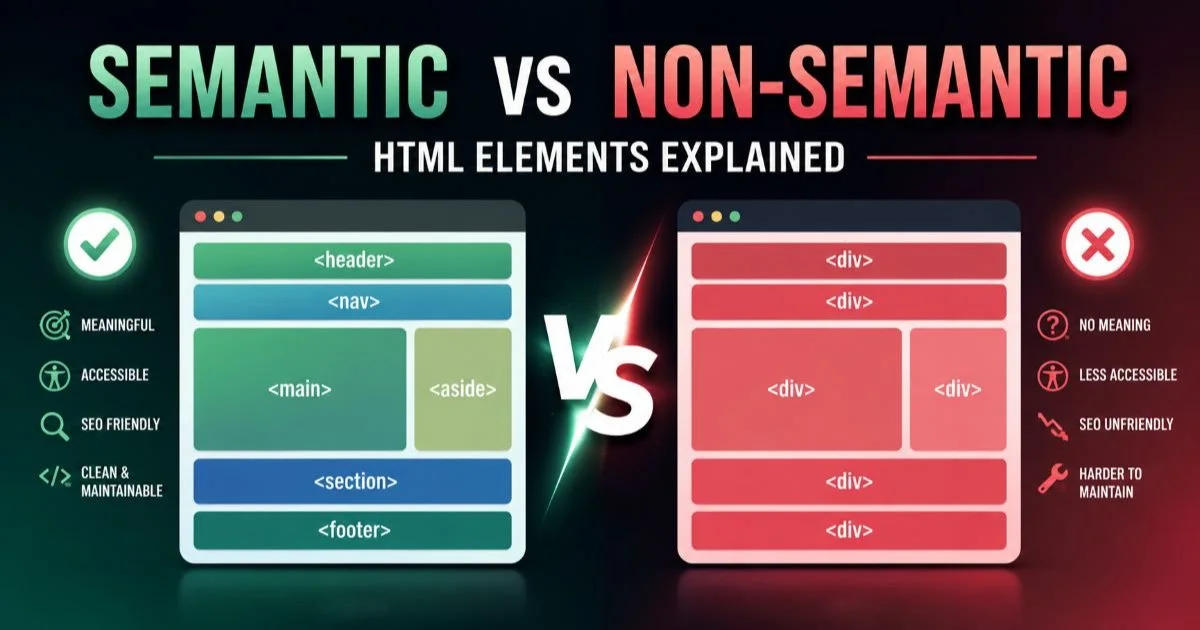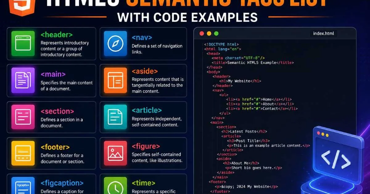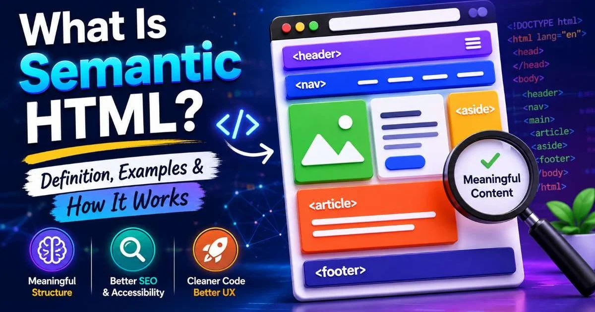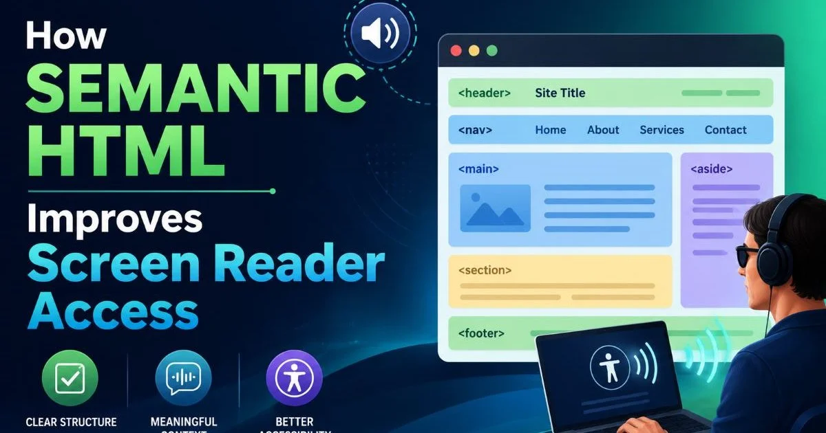
Semantic HTML sits at the foundation of accessible web design, yet many frontend developers still reach for generic <div> and <span> elements when building layouts. This habit creates pages that look fine visually but become nearly impossible for screen readers to interpret meaningfully. When you use proper semantic elements like <nav>, <main>, <article>, and <aside>, you give assistive technology a structured map of your content.
That map lets users jump between sections, understand relationships between blocks, and navigate with the same efficiency that sighted users enjoy. The gap between a well-structured page and a div-soup page is enormous for someone relying on a screen reader. This guide walks you through four practical steps to improve HTML accessibility using the right elements in the right places.
By the end, you will know exactly how semantic HTML improves screen reader access and what changes to make in your own codebase today. If you want a deeper foundation on what semantic HTML is and how it works, start there before diving into these steps.
Key Takeaways
- Replacing generic divs with semantic elements gives screen readers a navigable document outline immediately.
- Proper heading hierarchy lets users skim pages the same way sighted readers scan headings visually.
- ARIA roles are supplements, not substitutes; native HTML elements carry built-in accessibility for free.
- Landmark regions like
<main>and<nav>enable one-keystroke navigation in most screen readers. - Testing with actual screen reader software reveals problems that automated audits consistently miss.
Step 1: Replace Generic Containers with Landmark Elements
The single most impactful change you can make is swapping out <div> wrappers for proper HTML landmark elements. Screen readers like NVDA, JAWS, and VoiceOver expose landmarks as a navigable list. When a user presses a shortcut key (D in NVDA, for instance), they jump directly to the next landmark region. A page built entirely with <div className="header"> and <div className="sidebar"> offers zero landmarks, forcing the user to tab through every single element linearly.
Start by auditing your templates. Look for the outermost wrappers and ask whether each one maps to a standard HTML5 element. Your site header becomes <header>, the primary content area becomes <main>, sidebars become <aside>, and your bottom section becomes <footer>. These are not just "nicer" divs; they carry implicit ARIA roles that screen readers recognize without any extra attributes on your part.
Which Landmarks Matter Most
Not all landmarks carry equal weight. The <main> element is arguably the most valuable because it lets users skip past repeated headers and navigation to reach the actual content. Every page should have exactly one <main>. The <nav> element ranks second; if you have multiple navigation blocks, label each one with aria-label so users can distinguish "Primary navigation" from "Footer navigation" in the landmarks list.
The <aside> element is useful for supplementary content like related links or advertising, but overusing it can clutter the landmarks menu. Use it when the content is genuinely tangential. If you have a sidebar that contains your main calls to action, reconsider whether it belongs inside <main> instead. Thoughtful landmark placement transforms navigation for assistive technology users.
Use browser extensions like the Accessibility Insights landmarks view to visualize your page's landmark structure before shipping.
Step 2: Build a Logical Heading Hierarchy
After landmarks, headings are the primary way screen reader users navigate content. WebAIM's 2024 screen reader survey found that nearly 70% of respondents said they navigate by headings as their first strategy on an unfamiliar page. This means your heading hierarchy is not a cosmetic choice; it is a functional navigation system. Screen readers let users press H to jump to the next heading, or press a number key (1 through 6) to jump to a specific heading level.
A correct hierarchy starts with a single <h1> for the page title, followed by <h2> elements for major sections, and <h3> elements for subsections within those. Never skip levels for visual reasons. If your design requires a smaller heading style, use CSS to adjust the font size rather than dropping from <h2> to <h4>. Skipped levels confuse screen reader users because they suggest a missing section.
Common Heading Mistakes
One common mistake is using heading elements for non-heading content. Some developers wrap a call-to-action phrase in an <h3> purely because they want bold, large text. This pollutes the heading outline and adds noise for screen reader users who are trying to skim. Another mistake is having multiple <h1> elements. While the HTML5 specification technically allowed multiple <h1> tags within sectioning elements, the outline algorithm behind that idea was never implemented by any browser or screen reader.
To verify your heading structure, install a headings bookmarklet or use the best HTML code tester tools available to inspect your output. These tools will show you a flat list of all headings on the page. If that list does not read like a table of contents that makes sense on its own, your hierarchy needs work. Fix it before moving on to more advanced accessibility improvements.
Some component libraries inject headings at arbitrary levels. Audit third-party components to confirm they respect your page's heading hierarchy.
"A heading hierarchy is not decoration; it is the table of contents that screen reader users rely on to understand your page."
Step 3: Use Semantic Elements for Interactive and Structured Content
Beyond layout landmarks and headings, semantic HTML provides purpose-built elements for interactive patterns that developers frequently reinvent with JavaScript. The <button> element, for example, comes with keyboard operability, focus management, and an implicit ARIA role of "button" out of the box. A <div onClick={() => { ... }}> has none of that. You would need to add role="button", tabIndex="0", and a keydown handler for Enter and Space to replicate what the native element gives you for free.
The same principle applies to links. An anchor element <a href="..."> is announced as a link, appears in the links list of a screen reader rotor, and handles keyboard interaction natively. Using a <span> styled to look like a link breaks all of that. Screen reader users will not find it in their links list, and keyboard-only users cannot tab to it unless you manually add tabindex. The accessible web depends on developers choosing the right element first and styling it second.
Forms and Tables Need Labels
Forms are a frequent source of accessibility failures. Every <input> needs an associated <label> element connected via the for attribute. Placeholder text is not a label; screen readers may or may not announce it, and it disappears once the user starts typing. Group related fields with <fieldset> and <legend>. A set of radio buttons for "Payment method" should be wrapped in a fieldset where the legend reads "Payment method," giving screen reader users the context they need.
Data tables deserve the same care. Use <table> for actual tabular data (never for layout), include <thead> and <th> elements with scope="col" or scope="row", and add a <caption> to describe the table's purpose. Screen readers use this markup to announce row and column headers as the user navigates cells. Without it, a table becomes an incomprehensible stream of disconnected values.
| Element | Implicit ARIA Role | Screen Reader Behavior | Keyboard Support |
|---|---|---|---|
<button> | button | Announced as "button" | Enter and Space activate |
<a href> | link | Appears in links list | Enter activates |
<nav> | navigation | Listed as landmark | Landmark shortcut key |
<main> | main | Skip-to-content target | Landmark shortcut key |
<input> + <label> | textbox (varies) | Label read on focus | Tab to focus |
<details> | group | Announced as expandable | Enter or Space toggles |
When in doubt, check the ARIA Authoring Practices Guide for the expected keyboard interaction pattern of any widget you build.
Step 4: Test with Real Screen Readers and Audit Tools
Writing semantic markup is only half the work. You need to verify that your choices produce the expected experience in actual assistive technology. Automated tools like Axe and Lighthouse catch roughly 30% to 40% of accessibility issues. They excel at flagging missing alt text, low contrast ratios, and absent form labels. But they cannot tell you whether a screen reader announces your custom dropdown in a confusing order, or whether your landmark labels make sense in context.
Install VoiceOver (built into macOS and iOS), NVDA (free on Windows), or TalkBack (built into Android) and navigate your page without looking at the screen. Listen to how the screen reader announces each section. Does it say "navigation" when entering your nav? Does it read your form labels clearly? Does tabbing through interactive elements follow a logical order? These are questions only manual testing can answer reliably.
Building a Testing Routine
Build screen reader testing into your development workflow, not as a final gate but as a recurring check. A practical approach is to test after completing each major component. When you finish a new modal, open NVDA and try to use it. When you ship a new form, test it with VoiceOver. This catches problems when the fix is still cheap. Retrofitting accessibility into a finished feature takes three to five times longer than building it in from the start.
Pair automated and manual testing for the best coverage. Run Axe in your CI pipeline to catch regressions automatically, and schedule manual screen reader testing at least once per sprint. Keep a checklist of common patterns: landmark presence, heading hierarchy, focus management, and form labeling. Over time, your team will internalize these checks and the quality of your HTML structure will improve organically across every project.
Do not rely solely on automated testing. Nearly two-thirds of accessibility barriers require human judgment to detect and evaluate.

Frequently Asked Questions
?How do I audit my templates for missing landmark elements?
?When should I use ARIA roles instead of semantic HTML elements?
?How long does refactoring div-soup markup to semantic HTML take?
?Can having too many aside elements actually hurt screen reader navigation?
Final Thoughts
Semantic HTML is not an abstract best practice. It is the concrete mechanism that makes your pages usable for the millions of people who rely on screen readers every day. The four steps outlined here, replacing divs with landmarks, building correct heading hierarchies, choosing native interactive elements, and testing with real assistive technology, will produce measurable improvements in how accessible your web projects are.
None of these steps require a framework, a library, or a budget. They require knowledge and discipline, both of which you now have.
Disclaimer: Portions of this content may have been generated using AI tools to enhance clarity and brevity. While reviewed by a human, independent verification is encouraged.